
cheesegrits
Support Gopher
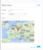
You don't need mediaqueries, overriding the fix 500px width with max-width:100% is working fine on my Samsung
The reason I'd like to use media queries is that we don't need to nail the popup to the left of the window, and decrease the map width, if it's on a normal screen.
I'm playing around with a basic setup at the moment, that applies your changes and chops the map width down from 400px to 300px if the max-width is <500px.
At some point we should probably look at having a set of template CSS files, with overrides for a better selection of common device sizes. That would make it much easier to handle stuff like this, just being able to toss specific overrides into the appropriate file (like template_640_css.php or whatever).
-- hugh
")